📌 Key Takeaway: A pool service landing page wins when it matches the visitor’s intent, proves trust fast, and makes the next step obvious.
How to Optimize Landing Pages for Pool Service Leads
A landing page should do one job: turn a visitor into a lead. For a pool service business, that means answering a homeowner’s first question quickly, showing clear proof that you handle the work well, and making it easy to request help. Strong design matters, but the real work happens in the message, the offer, and the path to contact.
That matters because most visitors are not browsing casually. They usually arrived with a problem in mind: a dirty pool, inconsistent service, a repair they do not want to chase down, or a seasonal need they want handled before it gets worse. If the page does not speak to that problem right away, the visitor leaves. If it does, the page can do serious work for the business.
The same principle applies across the rest of your operation. The more organized your lead flow, customer communication, and follow-up process are behind the scenes, the easier it is for your marketing to convert. Tools like EZ Pool Biller can help support that workflow with complete pool service management software, so the lead generation work on the front end connects cleanly to the business process on the back end.
Understanding Your Target Audience
A landing page works best when it speaks to a specific homeowner, not a generic visitor. Pool customers vary by service need, property type, and urgency. Some want weekly maintenance. Others need repair help. Some are comparing providers after a bad experience, while others are looking for a company they can trust long term.
That is why the page should reflect the problems your best customers actually have. A family-focused homeowner may respond to simple, reassuring language about reliable service and a clean, safe pool. A higher-end customer may care more about professionalism, consistency, and polished presentation. The point is not to create separate pages for every possible visitor. The point is to make the page specific enough that the right person feels understood.
One practical way to sharpen that message is to look at what leads already tell you. If calls and form submissions keep asking about seasonal openings, equipment issues, or routine cleanings, those are signals. Build the landing page around those real questions instead of guessing. That kind of alignment makes every other element on the page more effective.
Crafting Headlines and Subheadlines That Pull People In
The headline is the first test. It has to tell the visitor they are in the right place without making them work for it. Weak headlines waste attention. Strong headlines name the service, the outcome, or the pain point in plain language.
A vague headline like “Pool Services” does not do enough. A better headline tells people what they gain or what problem you solve. The subheadline should then add detail and reinforce confidence. Together, those two lines set the tone for the whole page.
Keywords still matter, but they should fit naturally. If people search for a pool service company in a specific area, your page should reflect that language without sounding robotic. The goal is clarity first, search visibility second. When both are present, you get a page that feels relevant to the visitor and useful to search engines.
A strong headline also keeps the page from drifting into generic marketing language. It gives the rest of the copy a clear job: explain the offer, prove credibility, and move the visitor toward action.
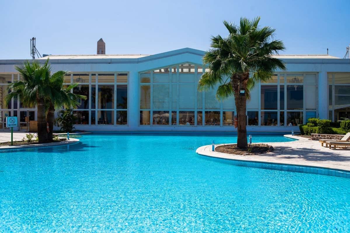
Using Images and Video to Show the Work
Pool service is visual. Visitors want to see the quality of the work before they trust the words. That makes strong images and short videos especially valuable on a landing page. Before-and-after photos can show the difference between a neglected pool and a properly maintained one. A short walkthrough can make your service feel more real and approachable.
The best visuals are specific. Show actual pools, actual results, and actual service conditions. Stock imagery can fill space, but real photos build trust faster because they prove the business does the work it claims to do. If you have a technician handling equipment, cleaning a pool, or checking a system, that image does more than decoration. It supports the offer.
Keep file sizes lean so the page loads quickly. A beautiful page that takes too long to open loses leads. Captions also help. They give context, add useful detail, and reinforce the message of the page without forcing visitors to guess what they are looking at.
A simple real-world example makes this obvious. A pool company that replaces a generic hero image with a real photo of a technician cleaning a green-to-clear pool, then pairs it with a short caption and a clear contact form, often feels more credible immediately. The page stops looking like marketing and starts looking like a business that does the work every day.
Writing CTAs That Make the Next Step Obvious
A landing page should never leave people wondering what to do next. The call to action needs to be direct, visible, and easy to understand. Visitors should not have to decode clever wording or hunt for a contact button.
Use action-focused language that matches the service you want them to request. The wording should be simple enough to scan in a second. The design should make the CTA stand out without overpowering the rest of the page. Color contrast, placement, and spacing all matter here.
It also helps to repeat the CTA where it makes sense. A visitor who is ready at the top of the page should not have to scroll for the opportunity to act. A visitor who needs more reassurance should see the same next step after reading about your services, your proof, and your process. The page should move with the reader.
Testing matters too. Small changes in wording or placement can change how people respond. If one version gets more form submissions than another, that is useful information, not a design preference. Use it.
Building Trust With Social Proof
People hire pool service companies when they believe the company will show up, do the work correctly, and communicate clearly. Social proof reduces doubt. Testimonials, reviews, and short customer quotes help new visitors feel safer taking the next step.
The strongest testimonials are specific. A vague compliment is less useful than a comment that mentions reliability, fast response, or a noticeable improvement in the pool itself. If you can include a name and location, the testimonial feels more grounded. That same principle applies to certifications, awards, or partnerships. These signals tell visitors the business has earned trust elsewhere.
You do not need a huge wall of praise. A few well-chosen pieces of proof can do more than a long list of generic compliments. The job is not to overwhelm visitors. It is to show them that other customers have already taken the leap and were glad they did.
This is also where good internal operations matter. If your follow-up, scheduling, and customer records stay organized, you can respond quickly when new leads come in. That makes your marketing promise feel real after the form is filled out.
Making the Page Work on Mobile and Load Fast
Most visitors will not study your landing page on a desktop monitor. They will see it on a phone, often while they are multitasking. That makes mobile design non-negotiable. The page has to resize cleanly, keep text readable, and make buttons easy to tap.
Speed matters just as much. If a page loads slowly, visitors leave before they ever read the message. Large images, heavy scripts, and cluttered layouts all slow performance. A landing page should feel light, direct, and easy to use.
Mobile optimization is not only about appearance. It is about reducing friction. Forms should be short. Buttons should be large enough to use comfortably. Content should be broken into sections that are easy to scan. The more effortless the page feels, the more likely the visitor is to complete the form or make the call.
If the page performs well on mobile, your traffic works harder for you. If it does not, you pay for visitors who never get a fair chance to convert.
Designing Lead Capture Forms That Get Filled Out
Lead capture forms should gather just enough information to start a conversation. Long forms create resistance. Short forms lower that resistance and increase the odds that a visitor will submit. Ask for the essentials first: name, email, and the basic service need.
The form should also feel worth completing. A clear benefit can help, whether that is a fast estimate, a service consultation, or a helpful next step. Visitors are more willing to share information when they know what happens after they click.
Placement matters too. A form buried at the bottom of the page limits its chances. A good landing page gives people multiple moments to act, including after they have seen your offer, your proof, and your service details. That way the form appears when interest is highest.
The back end matters as much as the front end. Integrating lead capture with EZ Pool Biller helps keep follow-up organized so leads do not sit in limbo. When the front-end page and the internal workflow connect, the business can respond faster and close more opportunities.
Using Data to Improve the Page Over Time
A landing page is never really finished. The first version gives you a starting point. The next version should be better because it learned something. That is why performance data matters so much.
Track where traffic comes from, how long visitors stay, where they drop off, and how often they convert. Those signals tell you what is working and what needs to change. If a headline attracts clicks but visitors leave quickly, the page message may not match the promise. If a form gets views but few submissions, the form may be too long or too hidden.
A/B testing can sharpen every major element on the page. Test headlines, CTA wording, image choices, form length, and section order. Keep the tests focused so you can tell what actually made the difference. If you change too many things at once, the result is harder to read.
Feedback also helps. When visitors ask similar questions or raise similar concerns, the page may be missing something important. Use that input to tighten the copy, improve the layout, and remove confusion. The best landing pages are built from real behavior, not guesswork.
Closing the Loop
A high-performing landing page blends message, proof, and usability. It speaks to the right customer, answers the right concern, and gives that visitor a clear next step. When your page does those three things well, it becomes a reliable source of pool service leads instead of a digital brochure.
The other half of the job is what happens after the lead arrives. Organized follow-up, clean customer records, and a dependable service workflow make the marketing effort pay off. That is where EZ Pool Biller fits naturally as complete pool service management software. When your systems support the promise on the page, the page has a much better chance of turning interest into booked work.